“Unofficial War Artist”

From this year we get to choose which subject we’d like to study during the CTS sessions, and I’ve chosen Exhibition studies. This is because it is a subject which I don’t know much about, but something close to me (someone who’s studying design/art).

In the first session, we were told that we will be able to go to different exhibitions every week, which is very exciting and practical.  On the October 13th, we went to Imperial war museum to see “Unofficial War Artist” by Peter Kennard. He is a London born and based Photomontage artist. We had a sheet of paper with questions to answer, such as “Consider the physical layout of the exhibition. Is a particular flow or trajectory through the exhibition indicated?(Linear, chronological, etc?)”. 

Here’s some pictures that I took while looking through his works.

OLYMPUS DIGITAL CAMERA

OLYMPUS DIGITAL CAMERA

OLYMPUS DIGITAL CAMERA

OLYMPUS DIGITAL CAMERA

OLYMPUS DIGITAL CAMERA

OLYMPUS DIGITAL CAMERA

We had some discussions time to time while looking through the place. I remember someone saying that what war-artist does is a documentation of war, and it tends to be archival. I do agree with this opinion on some extent, however, I found this particular show quite personal for the artist. This is because looking at the art works, most of them somehow represented how Kennard thought, and felt about war. One of the rooms were called the “Reading Room” which represented his actual reading room. The very last room, for me which was the most striking of all, represented the 50 years of his career as an “unofficial war artist”. I don’t have a clear answer to this, but weirdly I didn’t feel that depressed or uncomfortable in the exhibition. Last year when I visited the V&A to see the exhibition “Disobedient Objects”, which was deeply connected to protests in many countries, I couldn’t really stay in the space for long since I couldn’t take the atmosphere (almost traumatic, but still very interesting). Maybe this was due to the way the works were displayed, or maybe because there was loud audio playing for the whole time.  This exhibition (Unofficial War Artist) had more of a subtle, quiet, but very strong atmosphere. The use of media was quite interesting too. Especially in the last room, he used shadows as part of the pictures.


Long time no see

OLYMPUS DIGITAL CAMERA

I haven’t updated my blog for such a long time. My second year of university started just few days ago, and I thought I should some of the works I did at the end of last year and over this summer.

This book was made for last year’s CTS essay, and I wrote about ‘What is my role as a graphic designer?’

OLYMPUS DIGITAL CAMERA

OLYMPUS DIGITAL CAMERA

OLYMPUS DIGITAL CAMERA

This is a Research document that I made for the summer project. As you can see from this book and the other book, I feel like I’m quite stuck with page layout ideas right now. They all look the same, and when it becomes repetitive, it’s boring. I admire people who can design many kinds of layouts, both simple and decorative, according to the content of the book. Since I was always doing Japanese binding last year, I would like to learn more interesting and complex binding methods, to extend my skills.

OLYMPUS DIGITAL CAMERA

OLYMPUS DIGITAL CAMERA

Nature’s Texture

holland park copy Since my friend needed to do some research for her work, we had a little visit to Holland Park yesterday. These are some of the photos I took there. It was my first time visiting this park, and it was a very relaxing and peaceful place to be in. There were quite a lot of squirrels there, which made me happy. (Typefaces: ZnikomitNo24/title (http://www.fontsquirrel.com/fonts/znikomitno24), Avenir Next Condensed ) OLYMPUS DIGITAL CAMERA OLYMPUS DIGITAL CAMERA OLYMPUS DIGITAL CAMERA OLYMPUS DIGITAL CAMERA OLYMPUS DIGITAL CAMERA OLYMPUS DIGITAL CAMERA OLYMPUS DIGITAL CAMERAOLYMPUS DIGITAL CAMERA

CTS Lecture 3 / The Author

11_dear-lulu-patrick-gasselsdorfer-05

“Authorship has become a popular term in graphic design circles, especially in those at the edges of the profession: the design academies and the murky territory between design and art. The word has an important ring to it, with seductive connotations of origination and agency. But the question of how designers become authors is a difficult one. And exactly who qualifies and what authored design might look like depends on how you define on how you define the term and determine admission into the pantheon.” – Michael Rock: The Designer As Author

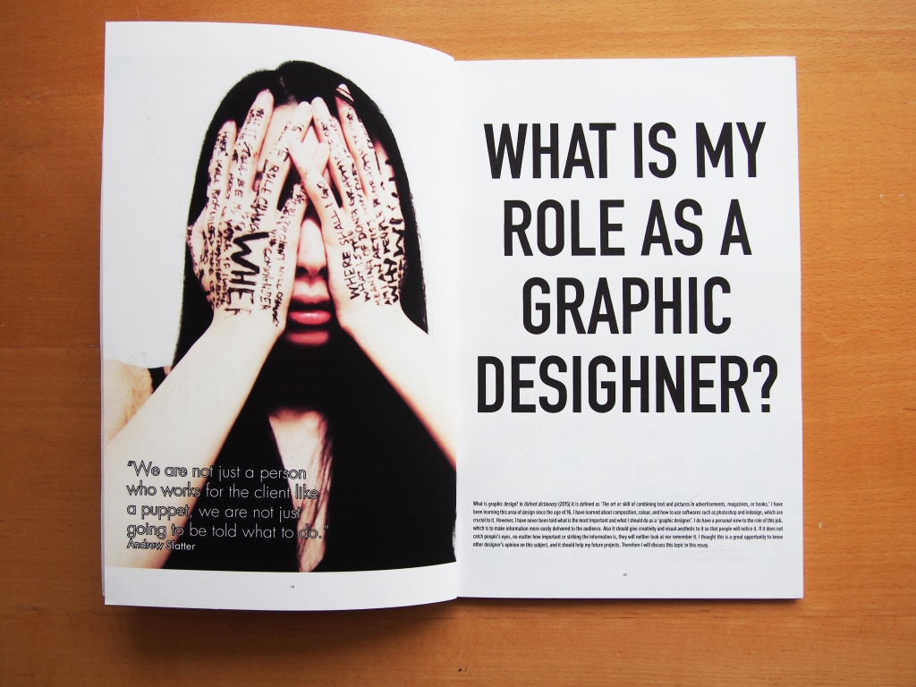
This is a quote which was on the moodle of LCC to introduce us to this Lecture: The Authorship. This lecture was a introduction for us to the authorship in graphic design mainly. At the beginning, we were told that graphic design is not just about visual enterprise. We are not just a person who works for the client like a puppet, you are not just going to be told what to do. Since the technology is quite developed now, we can take a picture, for example, and write a caption to it. Graphic design is empowered through technology nowadays. We were also told that the growth of media (film, radio, advertising, newspapers, and the illustrated press) is melting down traditional artistic genres and corroding the border between writing, reading, authoring, and editing. Therefore the growth of media is affecting on how people produce works.

As an example of designers as producers, we were introduced to a project called ‘Dear LuLu’. LuLu is a website which works as a branch between authors and audiences. People post their works (children’s books) on LuLu and the others will order it on LuLu and pay to LuLu, and then the book will be delivered to the client.(https://www.lulu.com) This project was a ‘experiment of print on demand’ by James Goggin (Practise) with students of the faculty of Design at the University of Applied Sciences Darmstadt & Prof. Frank Philippin. Here’s the description of it on LuLu.

Dear Lulu is a test book which was researched and produced by graphic design students at Hochschule Darmstadt, Germany, during an intensive two-day workshop with London-based designer James Goggin (Practise). The book’s intention is to act as a calibration document for testing colour, pattern, format, texture and typography. Exercises in colour profile, halftoning, point size, line, geometry, skin tone, colour texture, cropping and print finishing provide useful data for other designers and self-publishers to judge the possibilities and quality of online print-on-demand

We were told that technology allows us to publish work without the needs of publisher. This project was interrogating the relatively new print on demand production process acting as a colour type test plan of the very system which it was produced. They wanted to put the means of production into everyones hands, not only for people who had the ability to control it.

11

08

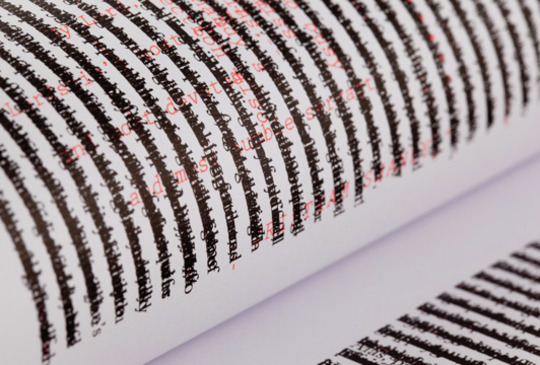
This is a book called Tree of Codes ( Jonathan Safran Foer) designed by studio Sara De Bondt Studio. They aimed to create a great ‘LOOKING’ stories, which is not just about the writing. They wanted to create a book which tells stories in a visual way, making it a new experience. They call it ‘visual reading’. It was said that it’s more like a artefact from some.

exterior6_0

_MG_7650

_MG_7620

_MG_7638

VisualEditions_TristramShandy_3
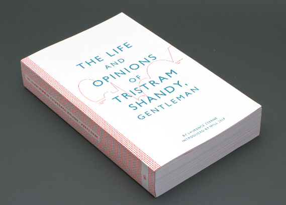
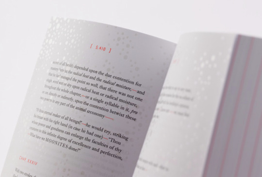
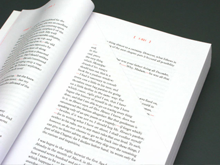
The Life and Opinions of Tristram Shandy, Gentlemen by Laurence Stern, designed by Practice for Everyday Life. This book was first published in 1759, and this book was so intensely modern and mood and attitude back then, and this how modern looking this book is is something shocking since it was published in middle of seven years war. It got rejected by publishers since people found it too quirky and too modern.

Jean-Arp.-Collage-with-Squares-279x395

Modern art by Hans Arp. He was one of the founding members of the Dada movement. This work is called ‘Arranged According to the Law of Chance’. The concept behind this work is

“[. . .] finally tore it up, and let the pieces flutter to the floor of his studio [. . . .] Some time later he happened to notice these same scraps of paper as they lay on the floor, and was struck by the pattern they formed. It had all the expressive power that he had tried in vain to achieve. How meaningful! How telling! Chance movements of his hand and of the fluttering scraps of paper had achieved what all his efforts had failed to achieve, namely expression. He accepted this challenge from chance as a decision of fate and carefully pasted the scraps down in the pattern which chance had determined

This unintentional and intentional bound up to each other gives us the question: what is the function of the author and the role of the reader in terms of how we interpret this work? What is the title of this work interpret to the audience?

We were told that the birth of the reader, costs the death of the author. Once the reader think about the work, make their imagination running, the work becomes something different from the author initially created. If the audience look at a work, and do not give concept to the work they are looking at (which makes that they feel that they may feel that they don’t understand the work) lets the author be still the author.

CTS Lecture 2 / Uncreative writing

2009_PSU_Goldsmith_960

Goldsmith-Wasting-Time-1200

This lecture started by introducing Kenneth Goldsmith, who is an American poet and conceptual artist. We learned that he had a class called ‘Wasting time on the internet’ in University of Pennsylvania. Here’s the explanation of this class on this university’s website(http://www.english.upenn.edu/Courses/Undergraduate/2015/Spring/ENGL111.301).

Live without dead time. — Situationist graffiti, Paris, May 1968    We spend our lives in front of screens, mostly wasting time: checking social media, watching cat videos, chatting, and shopping. What if these activities — clicking, SMSing, status-updating, and random surfing — were used as raw material for creating compelling and emotional works of literature? Could we reconstruct our autobiography using only Facebook? Could we write a great novella by plundering our Twitter feed? Could we reframe the internet as the greatest poem ever written? Using our laptops and a wifi connection as our only materials, this class will focus on the alchemical recuperation of aimless surfing into substantial works of literature. Students will be required to stare at the screen for three hours, only interacting through chat rooms, bots, social media and listservs. To bolster our practice, we’ll explore the long history of the recuperation of boredom and time-wasting through critical texts about affect theory, ASMR, situationism and everyday life by thinkers such as Guy Debord, Mary Kelly Erving Goffman, Betty Friedan, Raymond Williams, John Cage, Georges Perec, Michel de Certeau, Henri Lefevbre, Trin Minh-ha, Stuart Hall, Sianne Ngai, Siegfried Kracauer and others. Distraction, multi-tasking, and aimless drifting is mandatory.
He also wrote an article about this class on The New Yoker
The idea of this class is to make students see something from different viewpoint, by using glasses called ‘CREATIVE’. Anything can be something interesting once it has a concept, even something which seems completely dull. In this lecture we had a chance to try out something similar with this ‘uncreative writing’ class. We went on the internet and looked up whatever we wanted to: Facebook, twitter, news, etc. From those information, we were supposed to produce a piece of writing by only using the context we found on the internet.
wasting time
This is what I made. First I typed ‘waste / time / internet’ in google’s search bar, and I ended up in a website which shows the common way that people ‘waste’ their time on the internet. After that, I ended up in a website which is something completely opposite, which explain how you can you your time on the internet productively. However, there were some parts which matches both websites although ‘waste’ and ‘productive’ never goes together. I matched up the lines with colours which I thought is similar. I found this exercise quite fun, it was definitely not stressful. Our lecturer told us that if you really don’t know what to do, you can just give a new title to something and then that’s done. In this lecture, readymade art was explained as well. When I was listening to this lecture, it reminded me of the posts we see so often on Facebook. Picture or image with funny captions. I know these are not made for artistic purpose, but still it can be something similar to readymade art. Usually the picture is originally just a random photo, but by putting some extra information with the text, it turns in to completely different.
adopted-joke
kung-fu-bear
The word ‘ready made art’ reminds  (of course Marcel Duchamp was the initial thing which comes up in my head but other than that,) me of Sarah Lucas’  exhibition at White Chapel Museum I went when I was in foundation course. I find these kind of genre of art quite interesting since you are left to think while you look at the artwork. Why did the artist used this material, product? What is the message? It’s not only about the aesthetics. I think the reason why many people don’t get modern art because they don’t know that the concept of those art is one of the crucial point to it.

Good or Bad?

bad1 copy

bad2 copy

good1 copy

good2 copy

Few weeks ago, me and my group visited Shoreditch (London) for our project ‘Crimes Against Design’. We took some pictures of design that we found ‘good’ and ‘bad’. After that I asked some of my friends to give me feed back and this is how it went ↑

It was my first time visiting this place, and I found it quite interesting. It was mix of everything. If you look at right, there’s some fancy looking modern design store, and if you look at your left there’s a building which you can’t tell whether it’s an old shop or a restaurant because the sign has been washed away. It was also fun to walk through since there are a lot of street art. I did a little research about Shoreditch on the other day on the internet and according to the website ‘Stuck in London'(http://www.stuckinlondon.com/londonareaguide/shoreditch.php), it said that the positive side it right now are these:

  • vibrant creative culture
  • international community
  • great transport
  • great choice for eateries and bars

However it also has some downsides:

  • rising prices
  • traditional East End culture disappearing
  • gradually becoming less edgy and running the risk of becoming like Angel or Notting Hill

Apparently it starting loose it’s uniqueness. I think it may be nice if I can use this information for my project.

15-Second-Magic

One of our projects we are working right now is about creating 10 to 15 second film. The project’s name is ‘Genius Loci’. We were told to decide a place (wherever you like) and film it. The main key point to this is that whether we can convey the atmosphere of the place you chose has to the audience through this short video. And there’s another rule to it: record it with your phone.

I like watching films but taking one is not my strong point, so I’m struggling a little bit. 15 seconds are very short, and that’s why it makes it quite difficult.

The place I chose is….it’s difficult to describe. For this project, the location you choose supposed to be a specific place, but still I’ve been filming in different places to see what will be the best for me to work on, so I will just say North Acton(London) and some places in it.

Here’s some pictures from my experiments:

clip1

clip2

OLYMPUS DIGITAL CAMERA

OLYMPUS DIGITAL CAMERA